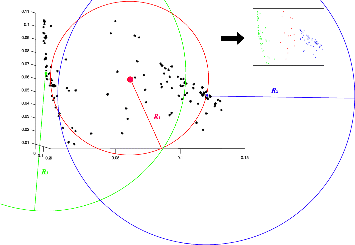
Fig. 3
From: ACES: a machine learning toolbox for clustering analysis and visualization

Cluster centroid detection. Using the distance matrix or raw data, all the identities are visualized as black points in the 3D PCA scatter plot on the left. The standard deviation of each identity is calculated by its corresponding row or column in the distance matrix. The red point with the highest standard deviation is first detected as the SI. Using the red searching window of SI, the green point is localized as the second centroid. As the common outliers of both red and green circles, the blue point is found as the third centroid. Using these detected centroids, the clustering results are shown on the right